Olive Green and Wood Living Room: 3 Modern Palettes
Design a warm, airy olive green and wood living room with three practical palettes for light oak, walnut, or mixed woods, plus renter-friendly styling tips.
An olive green and wood living room succeeds when the colors are chosen for the apartment you actually have—not copied from a finished room with different floors, windows, and furniture. The quickest route to a coherent scheme is to begin with the dominant wood finish, assess the available daylight, and then decide how deep and how extensive the olive should be.
Use the three palettes below as decision-ready recipes rather than rigid shopping lists. Each one identifies an appropriate olive range, a neutral base, a connecting accent, and the supporting rug, curtain, and metal finishes. There is also a renter-friendly route for adding olive without painting or buying a green sofa.
Start With the Wood You Already Own
A real apartment is usually defined by at least one wood element that is expensive, inconvenient, or impossible to change: flooring, kitchen cabinetry visible from the living area, a dining table, fitted shelving, or a substantial piece of inherited furniture. Treat that element as the starting point rather than an obstacle.
Begin by identifying three characteristics:
Value: Is the finish pale, medium or dark?
Undertone: Does it appear golden, orange, red-brown, neutral brown, grey-brown or slightly pink beside a plain white sheet of paper?
Coverage: Is the wood limited to a few pieces, or does it also cover the floor, cabinetry and shelving?
Inspect the actual finished surface instead of relying on the species name. Oak can look pale and golden, smoked and dark, or cool and grey depending on the cut, stain and finish. Pine, ash and walnut also vary. A sample or clear photograph of your furniture in the room is more useful than a label in a product description.
Once you understand the wood, assess the room at midday and after sunset. Then choose the olive depth. Sofa, rug, curtain and pillow decisions should follow that sequence.
Match the Olive to the Wood Finish
Pale or lightly finished wood
Light oak, ash and pale pine often work well with a softened olive that contains a little grey, beige or yellow. Pale, lightly finished woods generally appear less visually heavy than dark finishes and may reflect more visible light under the same conditions, although the result depends on the surface, sheen, illumination and amount of wood in the room.
Do not assume every pale wood is strongly golden. Hold olive upholstery or paint samples beside the real finish. If the wood looks cool or grey, choose a quieter olive rather than one with a pronounced yellow cast. If it looks honeyed, a slightly warmer olive can create an easier transition.
Walnut and darker finishes
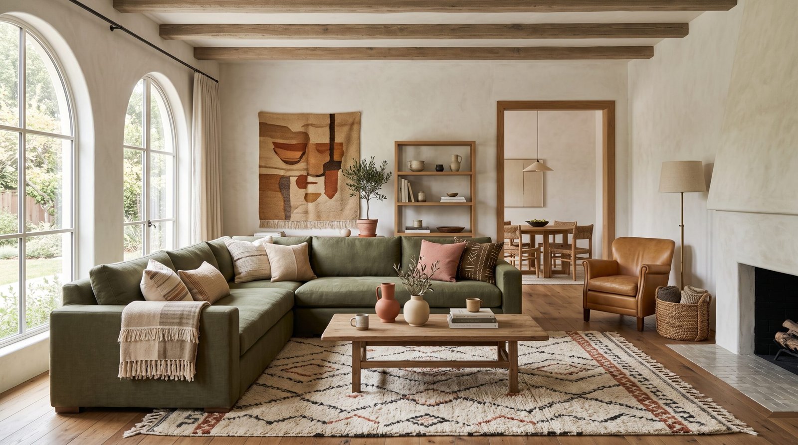
Dark wood can support a deeper olive, particularly when the room has substantial daylight and pale walls. This is where an olive green sofa with wood furniture can feel rich and deliberate rather than visually disconnected.
Check the actual undertone before adding rust or red accents. Some walnut and dark stains look warm and red-brown; others appear neutral, chocolate-brown or relatively cool. Burnt orange and oxblood are useful when the finish is visibly warm. Camel, warm taupe or muted bronze may be easier beside a more neutral dark brown.
Medium or mixed woods
When several wood tones share the room, use a restrained mid-depth olive and make warm ivory the dominant neutral. The ivory creates a consistent background while olive supplies contrast without demanding that every brown match.
Commercial color guidance commonly places olive beside ivory, beige, honey, grey and pale pink. These are useful starting directions, but the final decision should come from samples viewed against your own floor and furniture.
Will Olive and Wood Make an Apartment Feel Dark?
AI-generated editorial illustration for Tigemi showing material and texture detail for this guide.
A recurring concern in decorating discussions is whether an olive sofa will make a room feel darker. It can contribute visual weight, but the result depends on how much olive and wood you use, how clear the windows remain, and how much pale space surrounds the darker elements.
Control these five variables:
Olive surface area: In a dim room, choose one large olive element rather than an olive sofa, painted walls and matching curtains. If the sofa is green, keep the walls and window treatments lighter.
Wood coverage: Dark flooring, dark cabinetry and several large dark-wood pieces can merge into a heavy visual block. A study of rendered office interiors found higher aesthetic evaluations for light or medium wood colors and lower wood coverage than for dark, high-coverage conditions. Because the study concerned simulated offices rather than apartments, use it only as cautious support for controlling coverage.
Window access: Avoid placing tall, dark furniture directly beside or across the main window where it reduces the visible opening. Simulation-based research has also associated greater window access with a stronger sense of spaciousness, although its small, nonresidential sample does not establish a universal decorating rule.
Pale negative space: Warm-white walls, an ivory rug field, a light ceiling and uncluttered sections of wall keep olive and brown from forming one continuous dark mass.
Evening lighting: Use more than one light source. A floor lamp near the sofa, a table lamp across the room and a suitable overhead fixture produce a more flexible result than one ceiling light alone. Test bulbs with an appropriate color temperature and good color rendering, because artificial light can noticeably change how green upholstery and wood finishes appear.
For a low-light apartment, choose pale wood where practical, keep the largest upholstered piece neutral, and introduce olive through curtains, art or one chair. You will retain the palette without committing most of the room to a dark mid-tone.
Decide Where the Olive Should Go
Olive can be architectural, upholstered or purely decorative. Choose the level of commitment before shopping:
High commitment: An olive sofa or painted walls. Use one as the anchor unless the room is large, bright and intentionally enveloping.
Medium commitment: Curtains, an armchair or a substantial rug. These create a clear color statement but can move with you.
Low commitment: Pillows, throws, ceramics and artwork. This is the practical route for renters and for anyone testing olive before buying major furniture.
A useful apartment formula is one olive anchor, one small echo across the room, and a warm neutral between them. For example, pair olive curtains with a neutral sofa, repeat the green in a small artwork, and use wood furniture to establish warmth. The repetition makes the green look intentional without covering every surface.
Three Complete Olive-and-Wood Palettes
Palette 1: Light Oak, Soft Olive and Dusty Rose
Choose this palette when the apartment is small, the daylight is limited, or the existing floor and furniture are pale.
Wood: Light oak, ash or another pale finish, checked for its actual undertone.
Olive: Soft, slightly greyed olive on curtains, an occasional chair or a limited number of textiles.
Main neutral: Warm white, cream or oatmeal.
Connecting accent: Dusty rose, muted blush or mauve.
Rug: Ivory-dominant with a low-contrast linear or broken pattern.
Metal: Brushed brass or warm nickel used consistently.
The pink accent prevents the combination from becoming an undifferentiated field of beige, green and light brown. Keep it muted rather than sugary. One dusty-mauve cushion, a ceramic bowl and a small note in the artwork are enough.
Tigemi’s collection included dusty mauve and blush color families at the time of editorial review. Because pieces are described as one-of-a-kind, verify current availability before treating a particular color as the basis of the room.
Palette 2: Dark Wood, Deep Olive and Burnt Orange or Oxblood
This is the more dramatic choice for a room with useful daylight, lighter surrounding walls and a clearly warm dark-wood finish.
Wood: Walnut or another dark finish that appears warm when viewed in the room.
Olive: Deep olive on the sofa or a single painted wall.
Main neutral: Warm off-white, pale greige or light taupe.
Connecting accent: Burnt orange, rust, coral red or oxblood.
Rug: A light or mid-tone base with controlled rust, brown or terracotta notes.
Metal: Aged brass for warmth or black for sharper separation.
The accent should bridge the olive and the wood rather than simply match the sofa. Burnt orange can pick up a warm brown finish while remaining distinct from the green. Oxblood gives a darker, quieter result. If your wood looks neutral or cool rather than red-brown, test camel or muted bronze before committing to a red accent.
Burnt orange, coral red and oxblood pieces appeared in Tigemi’s collection during editorial review. Recheck the live collection immediately before publication or purchase.
Palette 3: Mixed Woods, Restrained Olive, Warm Ivory and One Pattern
Use this palette when replacing furniture is neither desirable nor realistic.
Wood: A mixture of light, medium and dark pieces.
Olive: Mid-depth and restrained, used on curtains, art or two small textile placements.
Main neutral: Warm ivory across the walls, larger upholstery and much of the rug.
Connecting accent: One expressive patterned textile containing a color that relates to the room’s warmest wood.
Metal: One repeated finish that adds order to the mixed furniture.
The patterned accent supplies character, but the surrounding upholstery should remain quiet. This is not an all-beige room: olive creates the contrast, wood supplies variation, and the single pattern gives the eye a focal point.
How to Mix Light and Dark Wood
AI-generated editorial illustration for Tigemi showing practical arrangement for this guide.
Light and dark woods can coexist when the contrast is repeated and visually spaced. They do not need to match, but each finish should appear to have a reason for being there.
Repeat a noticeable tone: Echo a dark coffee table with a dark frame, tray or lamp base elsewhere in the room. Two separated appearances read as a motif rather than an isolated mismatch.
Leave space between contrasting woods: Use a rug, upholstered chair, painted surface or open floor area to prevent pale and dark furniture from colliding visually.
Find a shared undertone: Different values are easier to combine when they share a golden, neutral or greyed quality. If the undertones conflict, let ivory upholstery and the rug act as buffers.
Add a separator: A slim black frame or aged-brass detail can create a deliberate boundary between two finishes. Use the separator more than once so it becomes part of the room’s visual structure.
Use a Moroccan Pillow Without Creating a Generic Boho Room
A Moroccan throw pillow does not need to introduce an entire decorative theme. In a modern earthy living room, its most useful role is to connect colors already present: the olive anchor, the wood undertone and one secondary accent.
Choose one patterned piece whose dominant color sits near your connecting accent. A dusty mauve piece can soften light oak and olive; burnt orange can connect deep green to a warm dark wood; amethyst or coral may provide contrast when those colors are already repeated elsewhere.
Keep the rest of the sofa pillow arrangement controlled:
Use plain cushions in linen-like, boucle or flat-woven textures around the patterned piece.
On a three-seat sofa, try two larger plain cushions at one end, the patterned cushion slightly off-center, and one smaller plain cushion at the other end.
Vary size before adding more pattern. A difference in scale creates depth without visual noise.
Repeat one minor color from the patterned cushion in a nearby book, ceramic object, artwork or rug detail.
Avoid adding several unrelated motifs merely because each one is individually attractive.
Tigemi describes its offerings as one-of-a-kind Moroccan Sabra silk throw pillows. Its editorial guidance also notes that “Sabra silk” is a market term that may cover rayon or viscose and recommends describing pieces as woven in the Sabra tradition rather than automatically claiming a specific plant-fiber composition. For any individual product, rely on its documented listing and avoid unsupported statements about fiber content, natural dyes, durability, sustainability, artisan compensation or provenance.
Choose the Rug, Curtains, Walls and Metals
Walls: Warm white and ivory are the most flexible backgrounds. Test pale greige carefully; a version that is too cool can make yellow-based olive look dull.
Curtains: Use olive curtains with a neutral sofa, or neutral curtains with an olive sofa. In a compact room, avoid making both elements equally dark and dominant.
Rug: Let the rug mediate between green and brown. It should contain the main neutral and may include a small amount of dusty rose, rust or another connecting accent.
Metals: Brushed or aged brass adds warmth. Black provides definition when mixed woods need separation. Choose one lead finish, then use any secondary metal sparingly.
Artwork: Look for compositions that repeat olive and one accent without matching every furniture color exactly.
When deciding what colors go with olive green and wood, do not evaluate accents in isolation. Rose, terracotta, oxblood, ivory and warm taupe work because they create transitions among the major surfaces. The right choice is the one that connects your specific green and finished wood.
Test the Palette Before Committing
AI-generated editorial illustration for Tigemi showing second-room application for this guide.
Olive can look yellower, greyer, browner or more saturated as the light changes. Paint manufacturers recommend sampling olive shades under different lighting and living with the options for several days before making a final selection. Apply the same discipline to upholstery and textiles.
Collect a large paint sample, an upholstery swatch and the largest available rug sample.
Place them directly beside the existing wood rather than evaluating them on a white desk or phone screen.
Review the combination in morning light, afternoon light and evening artificial light.
Move the samples between the wall near the window and the darker side of the room.
Photograph each test, but make the final decision in person because screens can shift color.
Test the lamps and bulbs you plan to use at night, especially if the olive appears grey or muddy after sunset.
Leave the samples in place for several days before ordering the sofa, rug or a large quantity of paint.
Common Mistakes to Avoid
Choosing olive from an inspiration image without comparing it with the apartment’s actual wood finish.
Assuming every oak is golden or every walnut is red-brown.
Using deep olive on the sofa, walls and curtains in a room with limited daylight and little pale negative space.
Pairing a strongly yellow olive with a cool greyed wood without testing the combination first.
Leaving one dark-wood piece isolated in a room of pale furniture instead of repeating its tone.
Adding several busy Moroccan throw pillows when one well-placed pattern would create a clearer focal point.
Buying accents that match the sofa but do nothing to connect it to the wood.
Relying on one overhead light and evaluating the palette only during daylight.
Using bulbs with an unsuitable color temperature or weak color rendering without checking their effect on the upholstery and wood.
Planning around a one-of-a-kind product without confirming that the exact piece remains available.
Practical Checklist Before You Buy
I have identified the dominant wood finish by value, undertone and coverage.
I have inspected the actual finish instead of relying only on the species name.
I have assessed the room in daylight and after sunset.
I have chosen one main olive placement: sofa, walls, curtains, chair or accessories.
I have selected an olive depth suited to the room’s light and wood coverage.
I have chosen a connecting accent such as dusty rose, burnt orange, oxblood, camel or one controlled pattern.
I have planned the walls, rug, curtains and metal finishes as one palette.
I have left enough ivory, warm white or another pale neutral around the darker elements.
I have repeated each noticeable wood tone or separated conflicting finishes.
I have planned several evening light sources at different positions or heights.
I have tested paint, upholstery and rug samples beside the real wood.
I have reviewed the samples in morning, afternoon and artificial light.
I have limited the sofa to one dominant patterned cushion.
I have checked the documented details and current availability of any one-of-a-kind textile.
The final decision order is simple: identify the wood, evaluate the light, choose the olive depth, control its surface area, and then add the connecting accent. That sequence turns an olive green and wood living room from a collection of attractive objects into a palette adapted to the apartment.
We use cookies to improve your experience and analyze site performance.
Accept cookies or manage your preferences at any time.
Essential
Always active
Required for the website to function properly and securely.
Preferences
Allow us to remember your settings and provide a more personalized experience.
Analytics
Help us understand how visitors interact with our website to improve performance.The technical storage or access that is used exclusively for anonymous statistical purposes. Without a subpoena, voluntary compliance on the part of your Internet Service Provider, or additional records from a third party, information stored or retrieved for this purpose alone cannot usually be used to identify you.
Marketing
Help us understand how visitors interact with our website to improve performance.